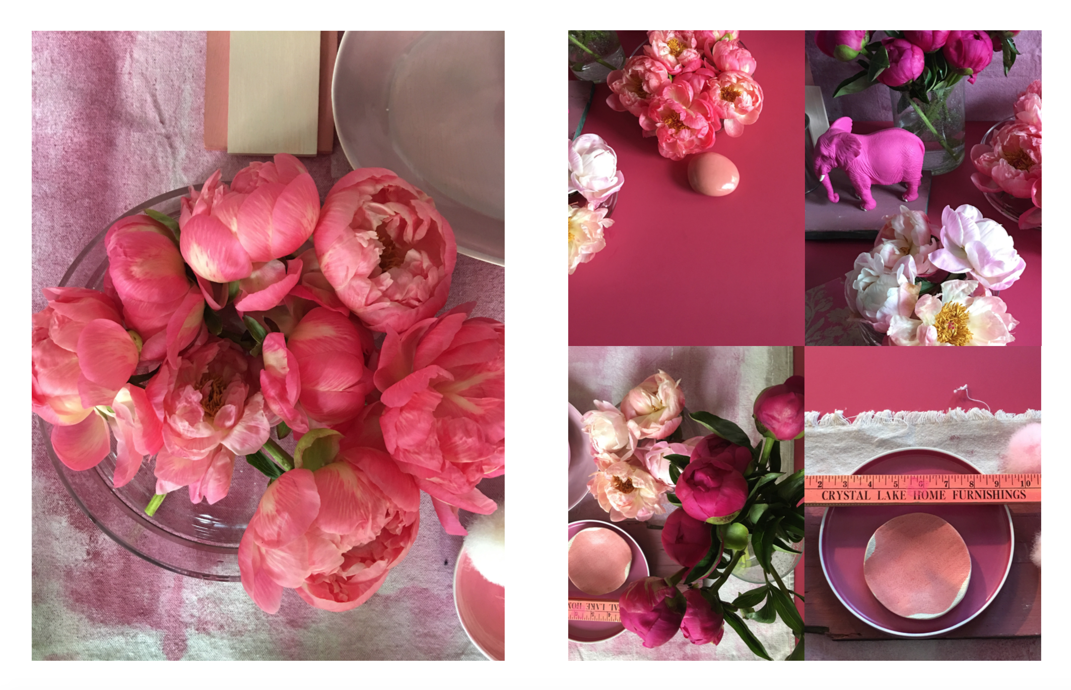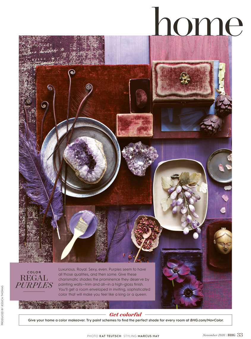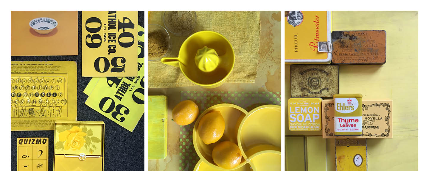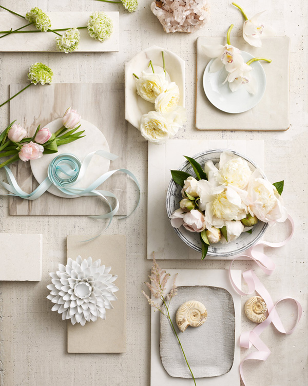
Photography: Kat Teutsch, Styling and Art Direction: Marcus Hay for SMH, Inc

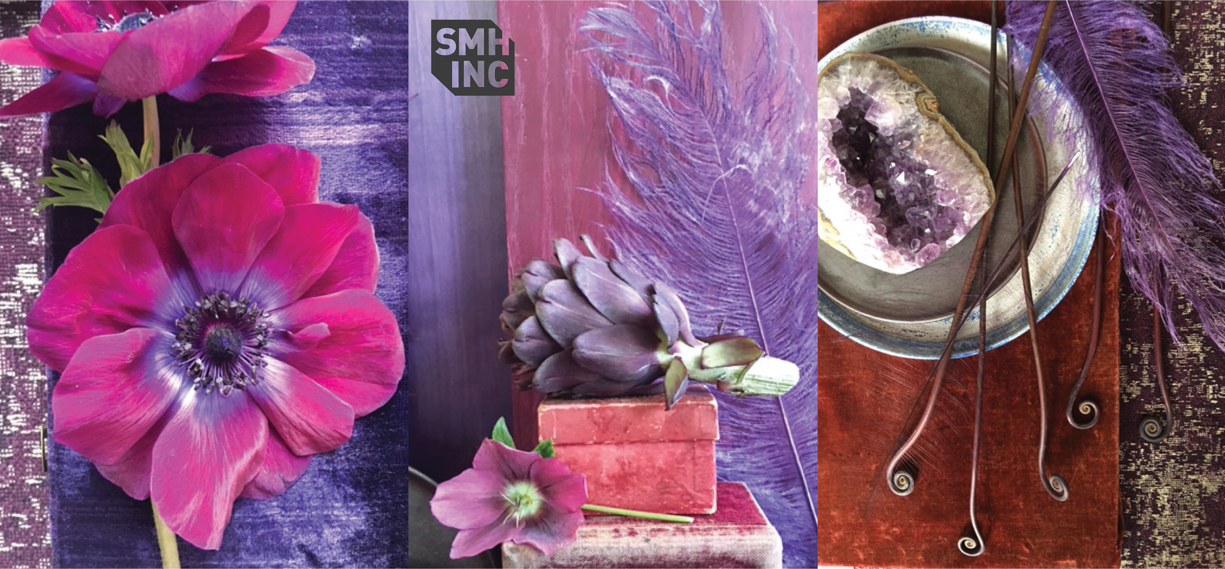
Out takes from the shoot, Photography: Marcus Hay for SMH, Inc
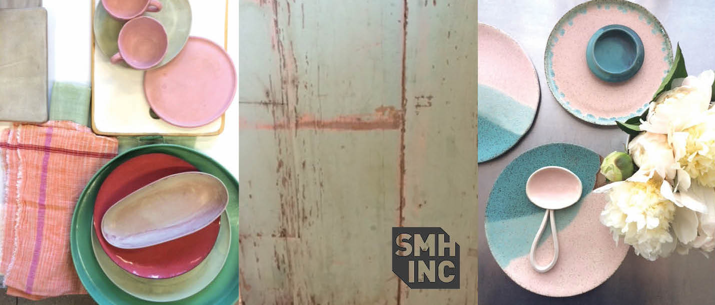
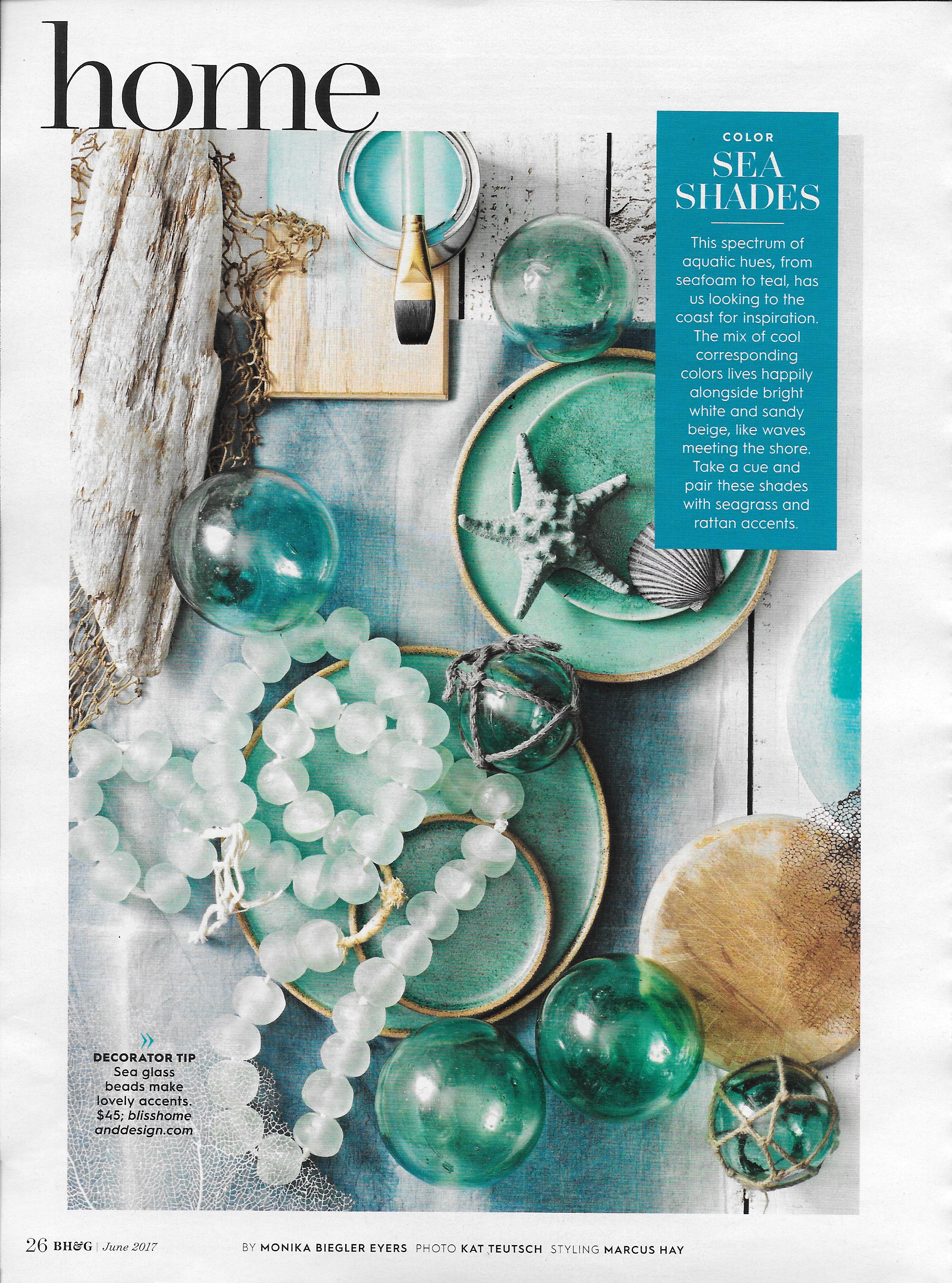
For the June issue of Better Homes & Gardens, Marcus was asked to pair up once again with the wonderful Photographer Kat Teutsch to work on a series of color trend related stories. You can see more to follow in the comings months. This time the subject matter was Sea Shades.
Having grown up near the beach most of my childhood and being very lucky to do so, This months Color Story was close to my heart reminding me of my earlier life in Sydney, Australia. Here at SMH, Inc we just love shades of blues and greens and nautical themes. Coral fans are just so magical and when paired with glass and driftwood, a still life comes alive, you can almost smell the ocean breeze.